All case studies
HOKU Protection Agency
Elite Security Brand Identity
HOKU Protection Agency
The challenge
HOKU was built on a single principle — protection should be felt, not seen. It needed an identity that delivers elite security through a quiet, refined presence for clients who value discretion, precision and control.
Our solution
Quantana designed the HOKU brand identity around the symbolism of a star — vigilance, guidance and quiet excellence — with a sweeping arc representing discretion, concierge-level service and 360° protection, in a bluish-grey and silver palette.
Scope and delivery
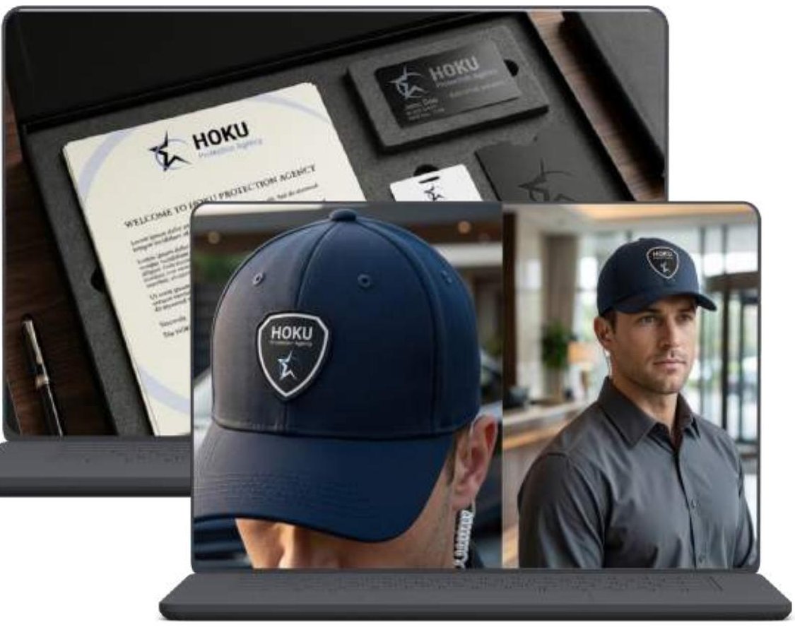
Delivered as a complete brand identity: story, mission and vision, logo rationale, typography, colour palette and logo variations for use across platforms.
Key capabilities
- Logo design with primary, stacked, icon and dark-background variations
- Brand typography system
- Brand colour palette (Vivid Blue, Onyx, Deep Blue, Silver, Platinum)
- Branded collateral, uniforms and packaging
Outcomes
- A modern vanguard mark that earns the respect of both the tactical Security Head and the ultra-wealthy Tech Founder
- Elite security branding with quiet authority and precision design
From ambition to action
Ready to audit your enterprise AI readiness?
Discover where AI can make a meaningful difference — and what it takes to get there responsibly.